
Page 370 - Contributed Paper Session (CPS) - Volume 7
P. 370
CPS2133 Alexander Schnurr et al.
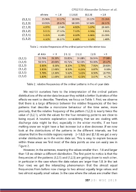
all data < -1.8 [-1.8,0) [0,1.8) > 1.8
(3,2,1) 25.96% 10.17% 18.59% 23.22% 23.26%
(1,2,3) 53.91% 29.67% 58.59% 57.60% 26.57%
(2,1,3) 4.97% 2.54% 4.92% 5.37% 20.30%
(3,1,2) 5.51% 27.12% 7.12% 4.26% 2.95%
(2,3,1) 5.15% 4.24% 4.10% 6.46% 25.09%
(1,3,2) 4.50% 26.27% 6.68% 3.10% 1.48%
Table 1 : relative frequencies of the ordinal patterns in the winter data
all data < -3 [-3,-1) [-1,1) [1,3) > 3
(3,2,1) 25.76% 28.30% 20.85% 24.08% 26.04% 27.08%
(1,2,3) 50.54% 20.00% 46.71% 52.33% 50.00% 29.17%
(2,1,3) 6.06% 8.30% 8.20% 5.70% 7.91% 20.83%
(3,1,2) 5.95% 15.00% 8.50% 6.24% 3.87% 0.00%
(2,3,1) 5.78% 13.30% 5.62% 5.62% 8.50% 18.75%
(1,3,2) 5.89% 15.00% 10.00% 6.03% 3.67% 4.17%
Table 2 : relative frequencies of the ordinal patterns in the all-year data
We restrict ourselves here to the interpretation of the ordinal pattern
distributions of the winter data because they exhibit a better illustration of the
effects we want to describe. Therefore, we focus on Table 1. First, we observe
that there is a large difference between the relative frequencies of the two
patterns that describe a monotone behaviour of the time series, more
precisely, that the relative frequency of the pattern (1,2,3) is nearly twice the
value of (3,2,1), while the values for the four remaining patterns are close to
being equal. A heuristic explanation considering that we are dealing with
discharge data might be that, especially in the winter months, if we have
melting snow we might have a fast increase but a slow decrease. If we now
look at the distributions of the patterns in the different intervals, we first
observe that in the middle regions namely [−1.8,0) and [0,1.8) we get a very
similar distribution as in the entire data set. This is easy to explain because
within these areas we find most of the data points as one can easily see in
Figure 2.
However, in the extremes, meaning the values smaller than -1.8 and larger
than 1.8 we obtain a different distribution. The first point to notice is that the
frequencies of the patterns (3,2,1) and (1,2,3) are getting closer to each other,
in particular in the case where the data values are larger than 1.8. In the last
four rows we get the interesting phenomenon that the almost equal
frequencies from before now change to two almost equally large values and
two almost equally small values. In the case where the values are smaller than
357 | I S I W S C 2 0 1 9