Page 103 - Invited Paper Session (IPS) - Volume 1
P. 103
IPS102 Arjan B.
            to get a complete picture of household welfare. The used household dataset
            allows  us  to  do  so  on  the  macro  and  micro  level.  It  includes  all  income
            transactions that add up to macro disposable income, on the individual and
            household  level.  This  allows  for  a  wealth  distribution  over  gross  disposable
            income deciles. 315 thousand households (4% of the population) are both in the
            bottom decile of the income distribution, and in the bottom decile of the wealth
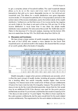
            distribution. Furthermore, we find that none of the income deciles has negative
            net worth (Table 4). The share in net worth of the top 10% and top 1% of the
            income  distribution  is  much  lower  than  it  was  when  the  simple  wealth
            distribution was considered. The ratios show this as well. The 10/40 ratio was 4.7
            (Table 2), this becomes 0.7 in the joint analysis, meaning that the bottom 40%
            has more assets than the top 10%. The 20/20 ratio drop from 56.8 to 2.8.

            4.  Discussion and Conclusion
                We have shown a large number of wealth inequality measures. Building on
            the  work  of  Bruil  (2018)  who  created  a  micro  dataset  for  the  Dutch  SNA
            household sector, we add net worth to the analysis. We showed that the concept
            of net worth greatly affects the levels of inequality.

                                 Table 4: Joint income and wealth inequality
                                          2015                         2016
                              Net worth   Net worth  Extended  Extended net Extended net  Net worth   Net worth  Extended net  Extended net   Extended net
                             according to  excluding  net worth   worth   worth   according to  excluding   worth   worth   worth
                               SNA   pension   (IRTS)  (IRTS +1%)  (IRTS -1%)   SNA   pension   (IRTS)   (IRTS +1%)   (IRTS -1%)
                                   entitlements               entitlements
              Gross Disposable Income shares
              D1 - lowest income  share in total   4.2%   4.0%   5.5%   5.4%   5.6%   4.5%   4.1%   5.7%   5.6%   5.9%
              D2                4.0%   3.1%   6.2%   6.1%   6.3%   4.0%   3.1%   6.2%   6.1%   6.3%
              D3                5.8%   5.3%   7.5%   7.4%   7.6%   5.8%   5.0%   7.4%   7.3%   7.5%
              D4                7.2%   5.9%   8.3%   8.2%   8.3%   7.4%   6.1%   8.4%   8.4%   8.5%
              D5                8.3%   7.0%   8.9%   8.8%   8.9%   8.7%   7.6%   9.2%   9.2%   9.2%
              D6                9.0%   7.7%   9.2%   9.1%   9.2%   9.2%   7.9%   9.3%   9.3%   9.3%
              D7                9.9%   8.5%   9.7%   9.6%   9.7%   10.0%   8.7%   9.7%   9.7%   9.8%
              D8               11.2%   10.0%   10.6%   10.6%   10.6%   11.5%   10.5%   10.8%   10.8%   10.8%
              D9               13.8%   12.9%   12.5%   12.5%   12.4%   14.3%   14.1%   12.8%   12.9%   12.7%

              D10 - highest income      26.6%   35.7%   21.7%   22.2%   21.3%   24.8%   32.8%   20.4%   20.8%

              Top 1%   share in total       7.1%       12.6%       5.4%      5.6%      5.2%       5.7%       9.6%      4.3%       4.5%       4.2%

              Ratios
              10/40              1.3       1.9       0.8      0.8       0.8       1.1       1.8       0.7       0.8       0.7
              20/20             4.9   6.8   2.9   3.0   2.8   4.6   6.6   2.8   2.9   2.7

                Wealth inequality is largest when pension entitlements are excluded, which
            is often the used concept of wealth studies. Including all pension entitlements
            has  a  levelling  effect,  but  wealth  inequality  remains  higher  than  income
            inequality. The choices made in the construction of these pension entitlements
            influence the macro level, but also the inequality measure. The sensitivity of the
            discount rate, by far the most influential parameter, shows that the Gini would
            drop by an additional 0.018 if the discount rate used for the public pension
            entitlements would be 1%-point lower, and that the Gini would increase by 0.014
            if the discount rate would be 1%-point higher. This effect is shown explicitly for
            the public pension entitlements, but the same would hold for the work-related
            pension entitlements. The requirements for the work-related entitlements in the


                                                               92 | I S I   W S C   2 0 1 9

