
Page 100 - Invited Paper Session (IPS) - Volume 1
P. 100
IPS102 Arjan B.
3. Result
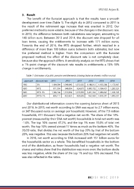
The benefit of the Eurostat approach is that the results have a smooth
development over time (Table 1). The slight dip in 2012 compared to 2011 is
the result of the retirement age increase that was enacted in 2012. Our
preferred method is more volatile, because of the changes in the discount rate.
In 2013, the difference between both calculations was largest, amounting to
148 billion euro. Between 2013 and 2014, the discount rate dropped for all
loan terms, causing the entitlements to increase with 171 million euros.
Towards the end of 2016, the IRTS dropped further, which resulted in a
difference of more than 100 billion euros between both estimates, but now
the preferred method is higher. From the comparison with the Eurostat
proposed method, the effect of the discount rate is not completely clear,
because also the approach differs. A sensitivity analysis on the IRTS shows that
a 1%-point change of the discount rate results in entitlements a 13%-19%
change in entitlements.
Table 1: Estimates of public pension entitlements (closing balance sheets; million euros)
approach discount rate 2011 2012 2013 2014 2015 2016
PBO 3% 1,104,594 1,049,045 1,072,632 1,108,912 1,153,286 1,172,967
ABO IRTS 971,594 949,894 924,875 1,095,792 1,184,437 1,283,321
ABO IRTS-1% 1,146,166 1,113,092 1,079,030 1,291,763 1,406,027 1,530,720
ABO IRTS+1% 836,111 822,025 803,636 942,968 1,013,291 1,093,237
Our distributional information covers the opening balance sheet of 2015
and 2016. In 2015, net worth according to SNA was equal to 2.7 trillion euros,
or 347 thousand euros on average per household. However, of the 7.9 million
households, 411 thousand had a negative net worth. The share of the 10%-
poorest (measured by their SNA net worth) households in total net worth was
-1.6%. The top 10% owned 47.2%, and the top 1% even 15.0% of total net
worth. The top 10% owned almost 17 times as much as the bottom 40%. The
20/20 ratio, that divides the net worth of the top 20% by that of the bottom
20%, was negative. This was because the bottom 20% had negative net worth.
In 2016, net worth according to SNA increased with 151 billion euros for
the households sector as a whole. This benefitted households in the bottom
end of the distribution, as fewer households had a negative net worth. The
shares and ratios show that the distribution was more even; the bottom decile
was less negative, while the share of the top 1% and top 10% decreased. This
was also reflected in the ratios.
89 | I S I W S C 2 0 1 9