
Page 115 - Contributed Paper Session (CPS) - Volume 2
P. 115
CPS1447 Russasmita S.P. et al.
designed to expose sampling variability, while adding more data points to the
least representative group plot, modified from Bakker (2004), is aimed to help
the students construct the idea of data size affecting representativeness of a
sample.
In contrast to most of activities shown in literature that seems to favour
computer simulation, we opted for hands-on activity for several reasons. First,
Indonesia is a developing country where not all schools are equipped with
sufficient facilities to conduct computer-enhanced lessons. We hoped that the
lessons will be more appealing for larger demographic, especially teachers in
rural areas and less financially-advantaged schools. Second, physical
manipulative and concrete representation of data is more engaging and
motivating for the students (Hunt, Nipper and Nash, 2011).
The design of activity was then consulted to the class teachers, before
being finalized and finally implemented in the classroom. During the
implementation, we took note of the students’ reasoning and how they
respond to the task. We were interested in the students’ informal reasoning,
that’s it, without employing any formulas, and how they use the data to
support their argument. For example in the first meeting, when asked to
describe and summarize their group chart, the students chose the data value
with the highest frequency, the maximum or minimum data value, as well as
any outlier that stands out. In the case that there are multiple modal values,
the students simply mentioned two numbers.
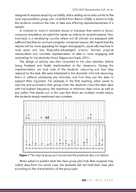
Figure 1 The original group plot (above) and the predicted class plot (below)
When asked to predict what the class group plot look likes suppose they
collect data from the whole class, the students did not built their class plot
according to the characteristics of the group plot.
104 | I S I W S C 2 0 1 9