
Page 276 - Contributed Paper Session (CPS) - Volume 2
P. 276
CPS1855 Nobutane H.
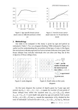
40.0 40
35.0 35
30
30.0
25
25.0
20
20.0
15
15.0
1985-1989 2010-2014 50-54 75-79
Figure 1. Age-specific breast cancer Figure 2. Trend in breast cancer
death rates in 1985-89 and that in 2010- death rates for 75-79 and that for
14 50-54
2. Methodology
Our data to be analyzed in this study is given by age and period as
indicated in Table 1. The Lexis diagram (Keiding, 1990) indicated in Figure 3 is
useful tool for understanding the properties of this type of data. In the figure
the vertical axis indicates age and the horizontal axis indicates time (year). And
those oblique lines indicate individuals who are alive and they die at the
endpoints of those oblique lines.
Figure 3. Lexis diagram Figure 4. Death rates on the Lexis
diagram
On the Lexis diagram the number of deaths given by 5-year age and
period, say ; = 1,2, … , ; = 1,2, … , , equals the number of end points of
those oblique lines within the squared area [ −1 , ) × [ −1 , ), where
−1 , = −1 , = 5, and death rate given by age and period, that is given
for [ −1 , ) × [ −1 , ) say , equals the expectation of divided by the
total of individuals’ survival time with in [ −1 , ) × [ −1 , ) say . Because
265 | I S I W S C 2 0 1 9