
Page 361 - Contributed Paper Session (CPS) - Volume 2
P. 361
CPS1887 Sahidan A. et al.
and the black dots illustrates the temperature points plotted consequently of
each day over 18 years. The red line demonstrates of a smoothest spline curve
that was fitted from cubic spline model. From the figure above, we can notice
that the seasonal patterns for different sub-regions in the same region were
quite similar pattern. There was a steady increase in June and the peak was
during July in summer. From August it was rapidly declined and leached the
lowest point in winter during December and January.
Secondly, we create another model for seasonal adjusted LST by day and
year with fitted model in order to estimate autocorrelation. In order to adjust
the seasonal for each series of data, seasonally-adjusted temperatures are
computed by subtracting the seasonal pattern from the data and adding a
constant (mean) to ensure that the resulting mean is the same as the mean of
the data over the whole period. The formula took the form as,
= − ̂ +
Where, is the seasonal adjusted LST at observation , is the observed
value, ̂ is the fitted value from natural cubic spline model and is the overall
mean of observed data. The data were fitted with the linear regression model
as shows in the figure 2 below:
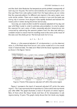
Figure 2 Trend of the seasonal adjusted LST within the same region
Figure 2 represents the trend of seasonal adjusted LST within the same
region 1. The Y axis represents the temperature in Celsius and X axis represents
year after 2000. The graph illustrates a total of 10 panels of central regions.
Nine of them show the linear trends (red line) of the temperature in sub
regions during 18 years. This graph clearly shows that the trends vary largely
350 | I S I W S C 2 0 1 9